Monday 24 June 2013

Color Combination Principles

The Colour Wheel


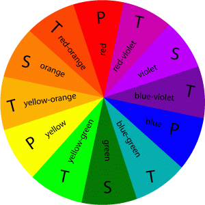
  • A color circle, based on red, yellow and blue, is traditional in the field of art.
  • Sir Isaac Newton developed the first circular diagram of colors in 1666. Since then scientists and artists have studied and designed numerous variations of this concept.
  • Differences of opinion about the validity of one format over another continue to provoke debate. In reality, any color circle or color wheel which presents a logically arranged sequence of pure hues has merit.

The Color Wheel (Primary Colors)

  • These are the 3 pigment colors that can not be mixed or formed by any combination of other colors. 
  • All other colors are derived from these 3 hues.

The Color Wheel (Secondary Colors)

  •  These are the colors formed by mixing the primary colors.


The Color Wheel (Tertiary Colors)

  • These are the colors formed by mixing a primary and a secondary color.


Monochromatic


  • A monochromatic color scheme consists of different values (tints, shades, and tones) of one single color.
  • Different shades, tones and tints of the same color can be used to give the impression of different colors and provide variety and interest.
  • A single color is considered unified, peaceful and harmonious.
  • Single colors are effective for establishing an overall mood and tying things together but are considered dull because of the lack of color variation.

Analogous (side-by-side) combinations


  • The analogous combination are any 3 colors that are side-by side (adjacent) on the color wheel. 
  • One color is often a dominant color while the other is an accent color (used for emphasis). 
  • The wide selection of possible combinations makes this a versatile scheme to use. For example: A selection of purples and blues or oranges and reds can be used to create this scheme
  • The similarity of the related colors makes the scheme harmonious. However, the use of more than three colors can dilute the overall effect on this scheme 
  • These are all analogous color combination schemes:
ORANGE + RED + Yellow

 (Secondary Colors)

  • Or a range of cool colors falling between blue and green:


BLUE + BLUE GREEN + GREEN

(Primary +          Tertiary             + Secondary)


A Color Scheme Based On Analogous Colors

  • Analogous colors are any three colors which are side by side on a 12 part color wheel, such as yellow-green, yellow, and yellow-orange. 
  • Usually one of the three colors predominates.


Color Context

How color behaves in relation to other colors and shapes is a complex area of color theory.


Color Contrast

  • The term contrast refers to the degree of difference between tones in an image. 
  • Contrast can be used to enliven a picture through the use of complementary contrasts such as warm and cool contrasts, or the differences in hue or color saturation.
  • When you have too much contrast, all subtlety between the colors is removed giving a 'day-glow' tone. 
  • If there is not enough contrast, all the colors appear washed out and faded. 
  • A complete lack of contrast will turn an image completely Grey.


Color Psychology
  • Color selection is a very important element that affects people emotionally and mentally on the subconscious level.
  • Human emotion can detect the effects of cool or warm colors evoking a sense of cool, tranquil relief with blues and greens or the excitement of red and orange.
  • Color has a long association with symbolism and affects us psychologically e.g. "seeing red" as associated with anger, being "green" with envy, or perhaps feeling a little "blue”. 
  • Within each of the colors available, there are limitless variations of hues and intensity. 
  • It can take a lifetime to understand the subtle distinctions among color ranges, but just knowing the general meaning of each color will help you choose the color thrust for the market you are intending to reach.

RED
  • A warm powerful and attention getting color. 
  • Red is a very visually empowering and attractive color for an e-book cover. 
  • The color red is extremely dominating.
  • Studies show that red can have a physical effect, increasing the rate of respiration and raising blood pressure. 
  • Use the red color to grab attention and to get people to take action. 
  • Use red when you don't want to sink into the background. 
  • Use red to suggest speed combined with confidence and perhaps even a dash of danger.


PINK
  • When red is highlighted with white we have pink, which is the softer side of red
  • Words associated with this market include: 
  • Romance, charm, beauty, sweetness, feminine, delicacy, refinement, calming, nurture, security, warmth, tenderness, intuitive, refined, sophisticated, well-bred, reserved, calm, even-keeled, non-violent.
  • People who like pink have similar personalities of reds but more subdued (reduced or low in intensity). They tend to be romantic and take care of those around them in a sensitive way. 
  • Soft, medium tints do not evoke much emotion - many people are indifferent to pink. It is sweetness, innocence, and uncomplicated emotions.

ORANGE
  • Orange is the most stable and reassuring of the earth tones 
  •  A combination of red, which commands action, and yellow which adds happiness making this a pleasant warm color.
  • As a warm color, orange is a stimulant 
  • –stimulating the emotions and even the appetite.
  • Because orange is also a citrus color, it can conjure up thoughts of vitamin C and good health.
  • Orange is mentally stimulating as well as sociable. 
  • Use it to get people thinking or to get them talking.

YELLOW
  • Pure yellow produces sensations of brightness and warmth reminding us of warm, sunny days. 
  • Yellow is the second most visually attractive color after red.
  • Although it can work as the primary color, yellow often works best as a companion to other colors.
  • Use bright yellow to create excitement when red or orange may be too strong or too dark.
  • Yellow and blue are a high contrast, eye-popping combination.
  • Mix yellow with neutral gray and a dash of black for a high-tech look.
  • In Asia yellow is sacred, and imperial.

GREEN
  • Green is a combination of blue and yellow.
  • The blue qualities represent peace and tranquility, while yellow brings happiness and light hearted feelings to this color.
  • Green is a strong color ranging from soft sage and willow, rich jade green, deep forest green and others. 
  • The new greens communicate peace and growth to your market and is considered a fresh, clean and revitalizing color that speaks of ecology and nature.
  • In China, green hats mean a man's wife is cheating on him. 
  • In France, studies have indicated green is not a good color choice for packaging. 
  • In India green is the color of Islam.
BLUE
  • Listed as the most popular color being the most preferred color universally. 
  • It is considered to be a "safe" color to use. 
  • Blue is one of the most calming colors and is often associated with the sky and the sea and evokes peaceful feelings.
  • It is regarded as therapeutic to the mind and body. 
  • Blue can "slow the pulse rate, lower body temperature, and reduce appetite.“ 
  • Blue is considered a business color because it reflects reliability.
  • Words associated with this color include: 
  • Trust, wisdom, tranquility, confidence, conservatism, reliability, belonging, coolness, quiet, truth, seriousness, harmony, serenity, patience, perseverance, peace, intelligence, unity, reassurance, trust, security, hope, generosity, cleanliness, order, sky, water, cold, technology, depression and loyalty.

WHITE 
  • White represents life and marriage in western cultures, but represents death in the Chinese culture.
  • Words associated with this color include: 
  • Cleanliness, purity, virginal, youth, simplicity, clean, immaculate, fresh, bright, peace, humility, precision, innocence, birth, winter, snow, good, cold, sterile, mild and spirituality.
  • People who prefer white tend to be neat and immaculate in their clothing and homes. 
  • White lovers are inclined to be cautious buyers and shrewd business people, but are critical and fussy. 
  • White can signify a self-sufficient person and occasionally the innocence and recall of youth and simplistic way of life.
  • People who dislike white are usually not very fussy. 
  • They do not need to have everything placed in an orderly straight line. They are easy going characters and not very uptight about life in general.
Black
  • People who like black may be conventional, conservative and serious, or they may think of themselves as sophisticated, or as being very dignified. 
  • Black lovers tend to feel uncomfortable with the super-sophisticated and feel insecure in their company. They like real people and are not usually dazzled by dignitaries.
  • People who hate black sometimes were frightened of the dark during childhood. That experience could be buried in the subconscious in the darkest recesses of the mind and may still haunt them when they look at anything black
  • Black may be simply too heavy and depressing for some people to handle at this point in their lives.


What to Avoid ?

Many people feel that primary colors go together. And indeed, there are many times when these combinations have been used successfully, especially with children's toys. But when viewed on the computer, it can be another story.


  • The reason that primary color combinations tend to not work is because both are high intensity colors, and so side-by-side they appear to vibrate. 
  • The eye cannot make the adjustment where the two colors meet, making this combination very hard on the eyes. 
  • This color combination can be used very successfully if you use shades or tints of one of the colors, for instance bright red and navy blue.
Dark on Dark 
  • Dark colors, especially dark colored text, on a dark background are very difficult to see

Although a lot of people try to use this combination, it is very difficult to read


Chapter 7 - Logos/ Symbols/ Pictograph

Logos

A logo is a unique identifying symbol.A logo also is called a brand-mark, mark, identifier, logotype, or trademark. A logo plays a key role in the visual identity of a brand, social organization, or company. A visual identity is the visual and verbal articulation of a brand or organization including all pertinent design applications, such as, letterhead, business card, and packaging, among many other possible applications.

Types of Logo

Logos can take the form of a word-mark.
Word-mark (also called logotype) is the name spelled out in unique typography or lettering.


Logos can take the form of a letter-mark. The logo is created using the initials of the brand name.


Logos can take the form of a symbol mark - an abstract or non-representational visual or a pictorial visual. An abstract symbol mark is a representational visual with an emphasis on the intrinsic form, an extraction relating to a real object modified with an abstract emphasis.


A non-representational or non-objective symbol mark is a visual which is a non-pictorial visual that symbolizes the brand or social cause, one that does not relate to a person, place, activity, or an identifiable object.


A pictorial symbol mark is a representational image that symbolizes the brand or social cause; it relates to an identifiable person, place, activity, or object. 


Combination mark is a combination of words and symbols.


Applications for a Logo

A logo should work for all necessary applications.
  • Packaging
  • Stationery (letterhead, business card, envelope)
  • Signage
  • Advertisements
  • Clothing
  • Posters
  • Shopping bags
  • Menus
  • Forms
  • Covers

Major Concerns in Logo Design

Concept
  • must be based on a design concept, which is the driving idea underpinning what you are depicting and how you are depicting it 
Expression
  • must communicate meaning 
Graphic design
  • The visual design of the idea must work together as a whole, stable unit

Way-finding Signs

Way-finding signs and systems are used internationally to assist and guide visitors and tourists to find what they are looking for in museums, airports, zoos, and city centers.


Sunday 23 June 2013

Chapter 5 & 6 - Layout and Poster

What is Layout ?

The way in which the parts of something are arranged or laid out.The arrangement of type and visuals on a printed or digital page.Concerns the organization and arrangement of type and visuals on two-dimensional surfaces to create effective visual communication.


Layout entails several interrelated goals.
  • To fit visual elements into a limited space
  • To arrange them so that they are functional, unified, and easily accessible to the viewer
  • To facilitate communication
  • To create visual impact
Process

To solve any graphic design problem, a designer must conceive an idea and realize it visually. The designer must create, select, and organize visual elements to create effective communication.

Types of Layout

  • Single page, such as a poster or a print advertisement 
  • Multi-page designs, such as: books, magazines, newspapers, brochures, web sites, and annual reports


Multiple page design                                                                   Single page design


Designing a Layout with and without a Grid

When a designer has to maintain balance, emphasis, rhythm, and unity throughout a series of consecutive pages, most designers use grids.A grid is a guide to a modular com-positional structure made up of verticals and horizontals that divide a format into columns and margins.

Some designers do not utilize a grid for multi-page applications, instead they design a compositional structure, page by page.
     
         Without grid


         With Grid


What are Posters ?

A large printed picture, notice, or advertisement displayed in a public place: "a poster campaign". A poster is a two-dimensional, single-page format .Used to inform (impart information, data, schedules, or offerings).The purpose of any poster is to communicate a message. In order to communicate a message, first, a poster first must grab a viewer’s attention.


When designing a poster, you should consider some key component such as :

  • Understanding the subject matter
  • Ordering information so it can easily be gleaned
  • Attracting the audience’s attention
  • Keeping it long enough to communicate the information or message


Primary goals of poster design:
  • Stop somebody. 
  • Communicate a clear and easily understood message. 
  • Create a design that can be seen from a distance.


Chapter 4 - Typography

What is Typography ?

The art or process of setting and arranging types and printing from them. It is also the design of letter forms and the arrangement of them in two-dimensional space (for print) and in space and time (for digital media). When creating a typography image you should consider the following.

Type Alignment

  • Flush left/ragged right:  text that aligns on the left side and is uneven on the right side 
  • Justified:  text that aligns on the left and right sides 
  • Flush right/ragged left:  text that aligns on the right side and is uneven on the left side 
  • Centered:  lines of type centered on an imaginary central vertical axis 
  • Asymmetrical:  lines composed for asymmetrical balance and not conforming to a set, repetitive arrangement


Spacing

Letter spacing :
The space between letters

Word spacing :
The space between words
 
Line spacing :
The distance between lines of type

Letter-form
The particular style and form of each individual letter of our alphabet .Each letter of an alphabet has unique characteristics that must be preserved to retain the legibility of the symbols as representing sounds of speech. Used by designers in three primary forms:
  • Calligraphy - Decorative handwriting or handwritten lettering 
  • Lettering - The letters inscribed on something. 
  • Typography
Typeface
The design of a single set of letter-forms, numerals, and signs unified by consistent visual properties.
  • These properties create the essential character, which remains recognizable even if the face is modified by design. 
Type style
  • Modifications in a typeface that create design variety while retaining the essential visual character of the face.


Chapter 3 - Fundamentals Of Graphics Design

Formal Elements 

The formal elements of art, also called the visual elements, are the basic units and the means artists use to create and design works of art.

Some formal elements are point, line, shape, space, value (light and dark), color and texture. With these simple elements an artist can create whole worlds of visual experience.


Line

Many paintings appear to contain no lines. Painted figures and objects have edges, however, and these are called contours or contour lines. Notice the vertical contours of the pillars, the horizontal and diagonal contour lines of the patterned floor and the many and varied curvilinear contours of the clothed figures.

 Many paintings appear to contain no lines. Painted figures and objects have edges, however, and these are called contours or contour lines. Notice the vertical contours of the pillars, the horizontal and diagonal contour lines of the patterned floor and the many and varied curvilinear contours of the clothed figures.

•A line is a mark made by a tool as it is drawn across a surface.
•The tool can be almost anything such as a pencil, a pointed brush, a computer and mouse, even a cotton swab.
•Also, a line is defined as a moving dot or point, or can be called an open path.


Shape

A shape is an enclosed two-dimensional area distinguished from its surroundings. Notice the geometric shapes that are formed by the edges of objects and figures in this painting. 

The stance of the soldier on the left forms a triangle, as does the seated woman on the right. The column on the right and the space between the column and the wall form polygons.

•The general outline of something is a shape, also defined as a closed form or closed path. It is a 2-dimensional line with no form or thickness.


Value

Value refers to the relative lightness or darkness of pigments. This black and white (also called gray-scale  image) of the painting shows the range of values the artist used to create this work. 

The light values in the soldier's cloak and the swords and the dark values in the background are clearly visible.

•Value describes the lightness or darkness of a visual element.

Color

Frequently it is the colors in a painting that first attract your attention. I have used red in the cloak and tunic of two figures in this painting to direct your eyes to the most important figures. The reds seem even brighter because of the browns, tans and grays that surround them.


•Diagram/additive color system
–When working with light, the three primaries are red, green, and blue.
–Primaries are also called the additive primaries because, when added together, they create white light.
–The color system of white light is called the additive color system.


Texture 

The actual surface of this painting is relatively smooth. It has little texture.

•The tactile quality of a surface or the representation of such a surface quality is a texture.
–Tactile textures are real; we can actually feel their surfaces with our fingers.
–Visual textures are illusionary; they simply give the impression of real textures.


Pattern

•Pattern can be defined as a repetitive arrangement of elements, like a wrapping paper design or a plaid shirt.


Balance

Balance is a key feature in designing. You have to equally distribute the weight of your project.A balanced composition can be symmetric or asymmetric.

An Asymmetrical picture
When you arrange dissimilar or unequal elements of equal weight on the page, it is called asymmetry.


A Symmetric picture
This image has symmetrical balance because it contains objects of the same weight and size on each side. One side of the woman in the picture is mirrored on the other side.


Emphasis

The arrangement of visual elements giving stress or importance to some visual elements.

  • Information to be gleaned easily.
  • The graphic design to be easily received.
  • The part of a design that is most accentuated.

How to create emphasis:

  • Use a series of evenly spaced, square photographs next to an outlined photograph with an unusual shape. 
  • Put an important piece of text on a curve or an angle while keeping all of the other type in straight columns. 
  • Use bold, black type for headings and subheads and much lighter text for all other text. 
  • Place a large picture next to a small bit of text. 
  • Reverse (use white type) a headline out of a black or colored box. 
  • Use colored type or an unusual font for the most important information. 
  • Put lists you want to highlight in a sidebar in a shaded box.
Example of emphasis picture


Chapter 1 & 2 - A Walkthrough Into Computer Graphics

So What is Computer Graphics ?

Computer graphics are graphics created using computers and the representation of image data by a computer specifically with help from specialized graphic hardware and software. Even thought computer graphic is a vast area of work line, it also can be categorize into mainly 8 different types of design methods.

-Information design
-Identity design
-Promotional design
-Branding
-Publication design
-Advertisement design
-Environmental design
-Media design

There are 5 essential component for a graphic design solution:

Strategy

The strategy is the master plan, a starting point to determine several key factors, such as:
  • The problem to solve
  • Objectives
  • Target Audience
  • Brand positioning
Concept

The design concept is the creative solution to the design problem
  • The underlying thinking or reasoning
  • For how you design a piece 
  • The primary idea behind the piece.
Design

Designing demands of a concept
  • Conceptualization and visualization
  • The integration of the concept and visual elements
Execution

The fulfillment of the concept through physical processes that include selection and manipulation of materials and/or software.

Production

Finally, manufacturing all the components into a meaningful design.


Solving a Design Problem: Process and Phases

•Step 1: Understand the problem.
             –Fully understand the assignment and the goal.
 
•Step 2: Gather information.
            –Information gathering is essential. 

•Step 3: Think by sketching (and writing). 

•Step 4: Choose your best thumbnail sketches and turn them into roughs. 

•Step 5: Choose your best roughs and turn them into comps. 

•Step 6. Production

Saturday 22 June 2013

Game Project : Bunneh vs Monster (Pre-Alpha-Demo)


                                  https://www.dropbox.com/sh/0rlpaui3er59lmo/Kstkw_6fhC

Hello guys, this is my final year project. This game project is made using a game engine called Unity. Keep in mind that this is still an alpha game demo so there will be many bugs and the final version will have many changes in it. So please give any feedback to the game and have a nice day .